One colour
Sage, always. A seasonal palette is a reason to buy a second bottle you don’t need.
Our story
“Serein” is a word for rain that falls from a cloudless sky — the kind of weather you don’t notice until you’re already in it. It is the closest word we know to what we wanted the bottle to feel like.
The studio
Serein started in a borrowed workshop in Portland with a single question: what would a bottle look like if nobody was trying to sell you a second one?
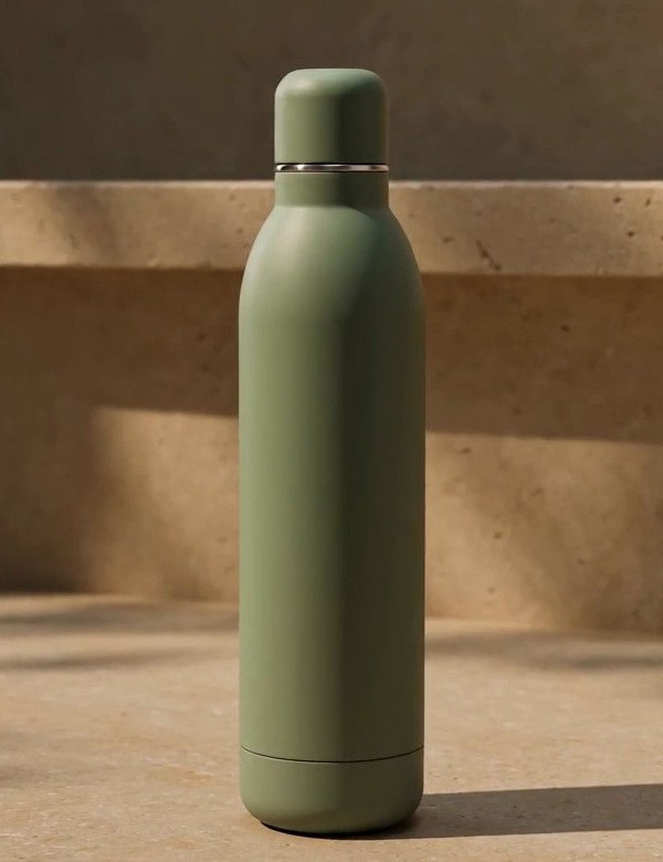
We settled on one colour — a matte sage that reads grey in low light and green in the sun — one finish, and one seam near the foot. The steel ring at the neck is the only part that reflects; it exists so the rest of the bottle can stay quiet.
There is no logo on the body. Not for lack of pride, but because a logo is a claim that the object needs to remind you who made it. Ours doesn’t.
“If a detail doesn’t help you hold it, fill it or put it down, it didn’t survive the second drawing.”
Sage, always. A seasonal palette is a reason to buy a second bottle you don’t need.
Replaceable seals, a finish that improves with handling, and a warranty that lasts longer than the novelty.
No straw, no handle, no app, no sleeve you can lose. The object is the whole idea.
“A bottle should be the least interesting thing you carry — and the most reliable.”
What we don’t do
No seasonal drops. No limited editions. No subscription that ships you a bottle every quarter. When a run sells out, we make the same bottle again.